A New Old Colophon
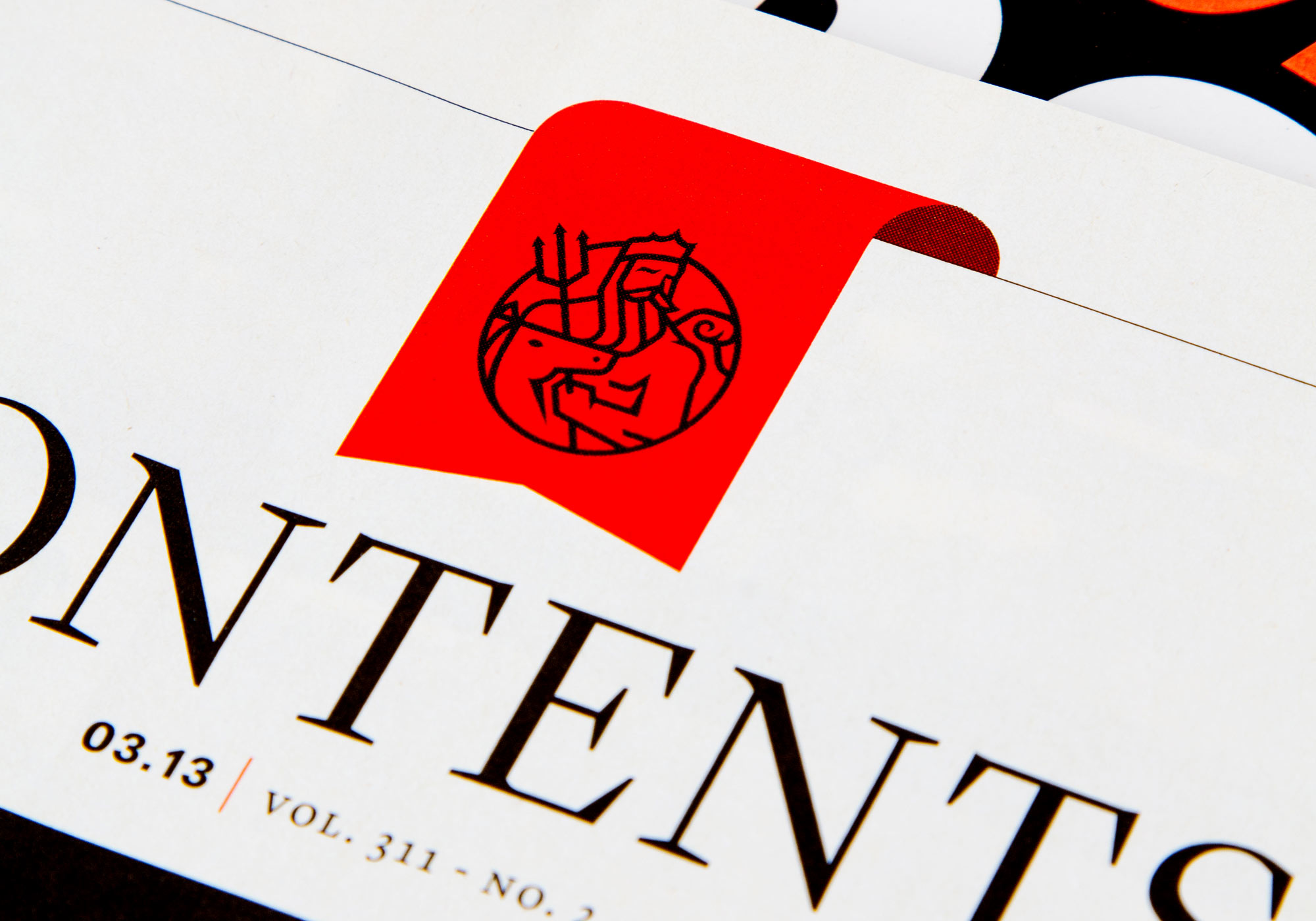
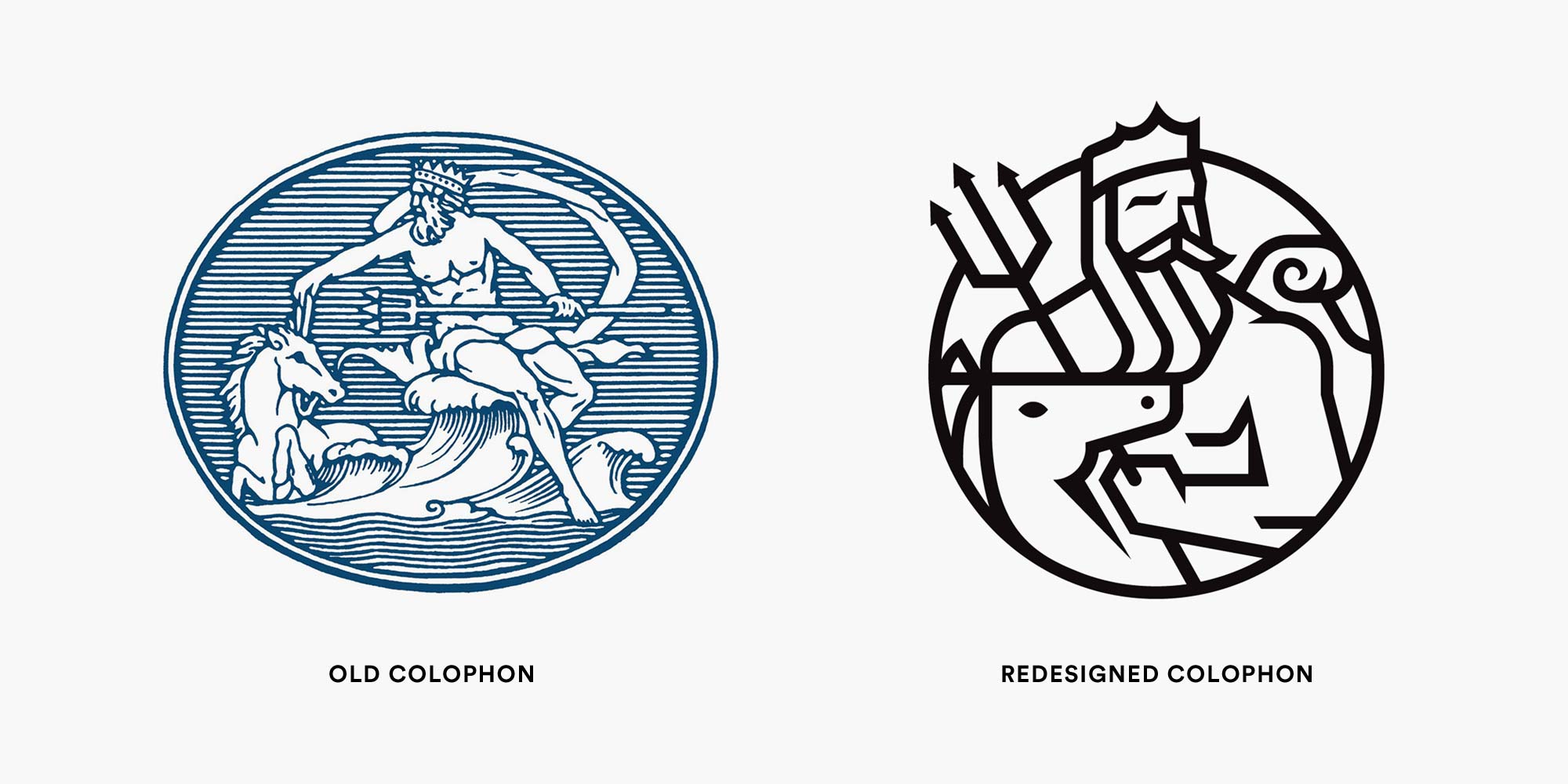
A few years ago, I had the privilege of assisting in the rebranding of The Atlantic magazine. My role was the rework an old colophon (essentially an old-school name for a publisher’s emblem that occasionally resides on a title page or at the end of an issue). The colophon also serves as a secondary logo for the publication. The previous colophon was of the Greek god Posedion and dated back to the 1920s, however, no colophon had been used for some time. It was not without its charm, but it didn’t match the progressive direction of the redesign. Creative Director Darhil Crooks charged me with exploring new, sleeker versions of this mark. I’d worked with Darhil before during his tenures at Esquire and Ebony. Also worth noting that Pentagram, under the direction of Michael Bierut and Luke Hayman, did the previous redesign. But hey, no pressure.
Anyway, I thought it would be fun to see some of the process behind one of my favorite pieces.
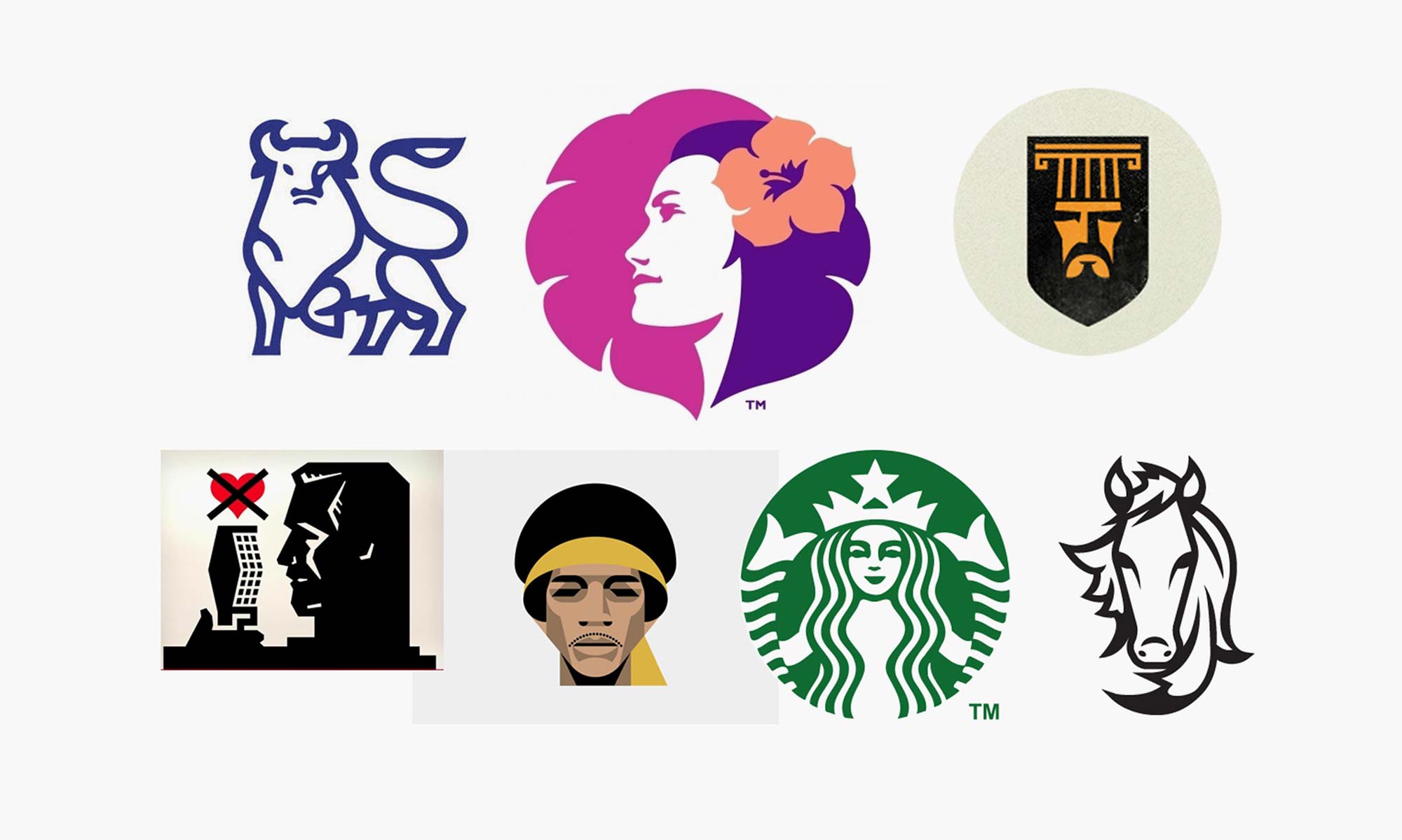
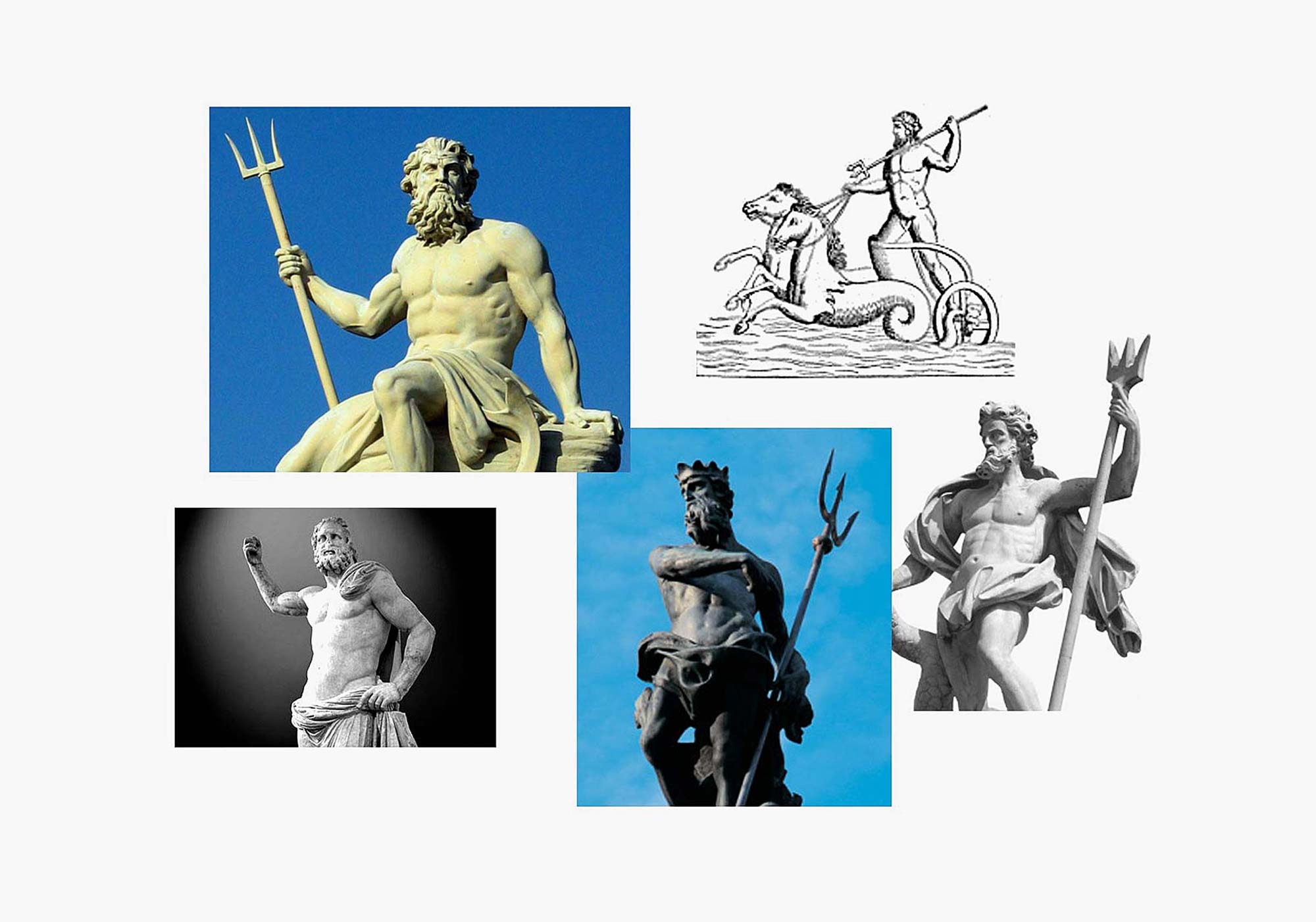
Above is some of the Poseidon reference as a starting point. I was told I needed to include the trident, some waves and at least one horse. Oh…he also needed to look fit and muscular but not “Jersey Shore ripped” (not sure if we used that term specifically, but at the time they were at the height of their popularity). I thought a three quarter view would create a more dynamic, visually appealing pose that would allow for him to appear looking off onto the horizon as if surveying what the future held.
We knew we wanted this to live as a one color mark, but we wrestled with how stylized to make Poseidon. We used the Starbucks siren as an abstract reference. She was an unmistakably a female form, and it’s implied that she’s a mermaid. The monoline outline of the Merrill Lynch bull had great movement which was appealing. We also liked visionary quality of the Hawaiian Airlines logo; she was obviously pondering something as she looked off onto the horizon. There was a nice aspirational quality and sophistication to that mark that we hoped to achieve as well.
Drawing on the Inspiration
Next we began the sketch phase. Quick disclaimer: I’m not a great artist. I don’t like to waste time making perfect sketches. Who are these people who make these elaborate sketches and then Instagramming them with their Micron pens surrounding it? I mean, that’s amazing, but it’s not me. The sketching stage feels more like idea generation and less about creating a gorgeous illustration. But that’s a bit off topic! Just know my sketches are winning no awards. You’ll see below…
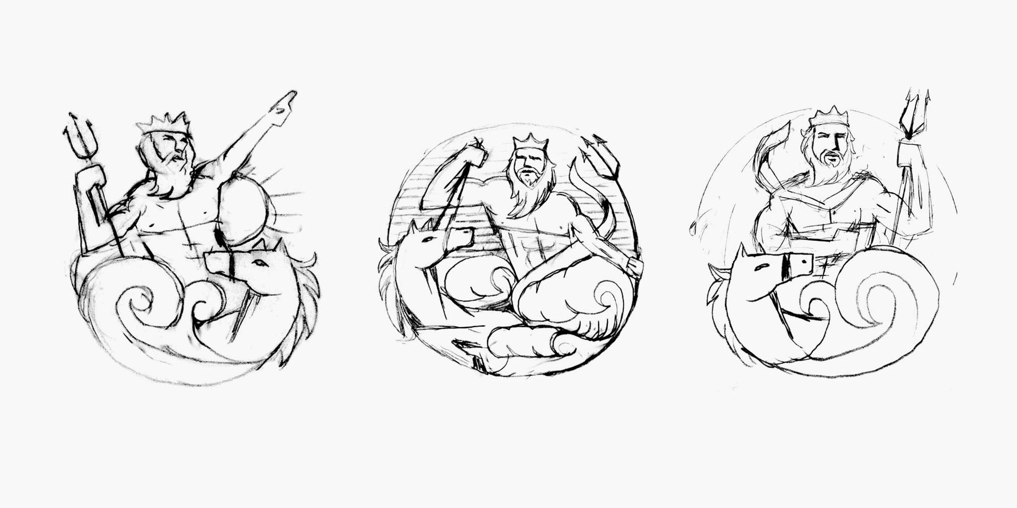
For the first round of sketches, I tried to more closely mimic the elements of the old colophon – the lined horizon, more waves, showing more of his body, etc. This proved to complicate the mark, and we realized it would never read at small sizes well. I kept a half an inch in mind as the test for visibility at the smallest size it would be used.
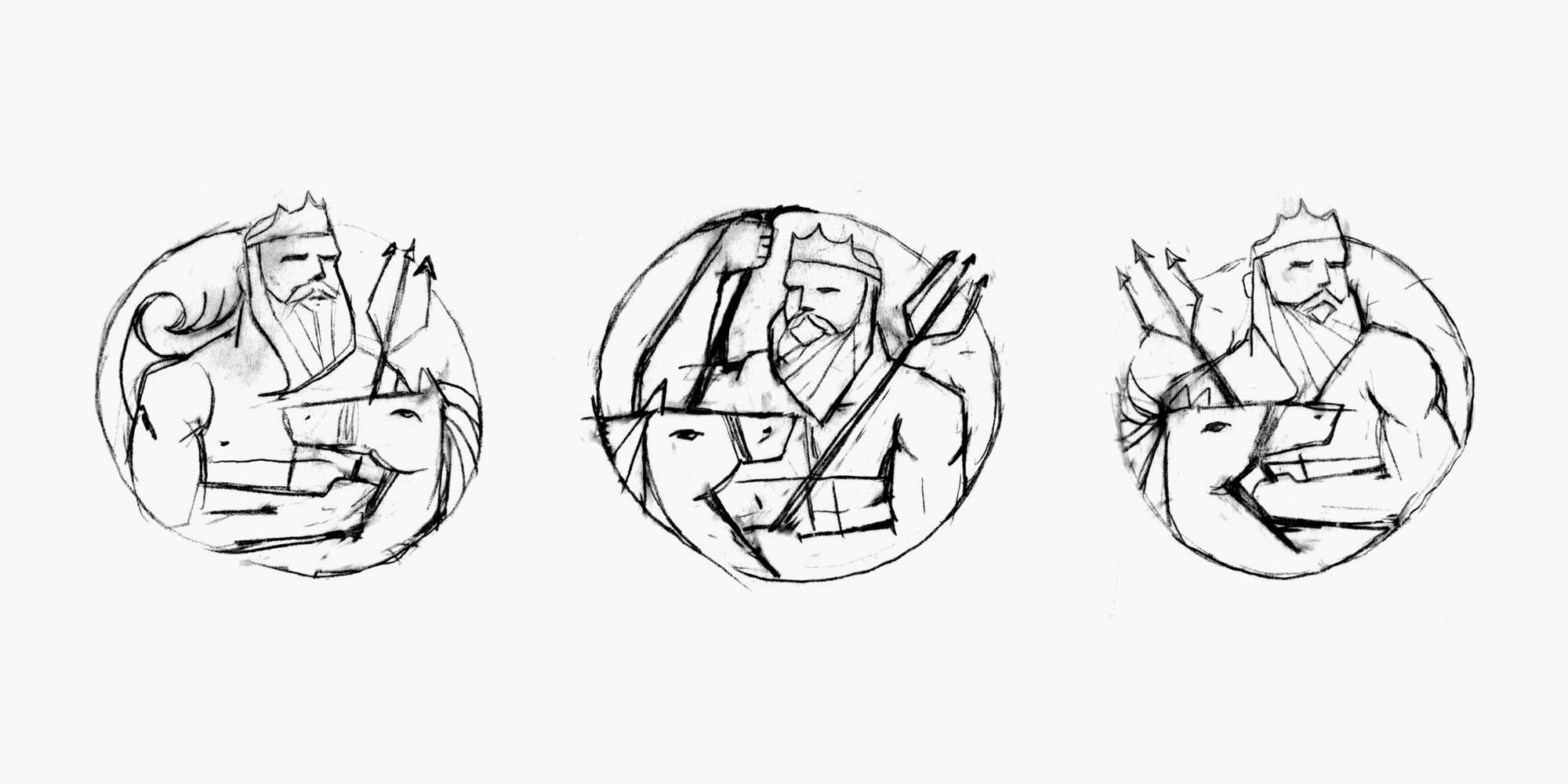
The second round of sketches proved more successful. We edited out all non-essential elements, keeping only the key components needed to communicate who this was and what he embodied.
After some more refining, the digital process began. I ended up doing 15 or so versions with varying amounts of tiny iterations to each one (I can’t begin to count wave options… breaking the circle, multiple crests, curling more, curling less, etc). In addition, some of early digital versions had odd proportions and mismatching angles. The first Poseidons more closely resembled Cubist art than a recognizable Greek god. Honestly, they’re too painful to show.
In the end, the team at The Atlantic loved where we landed. Darhil Crooks was so great on the project as well. His instincts always proved right.
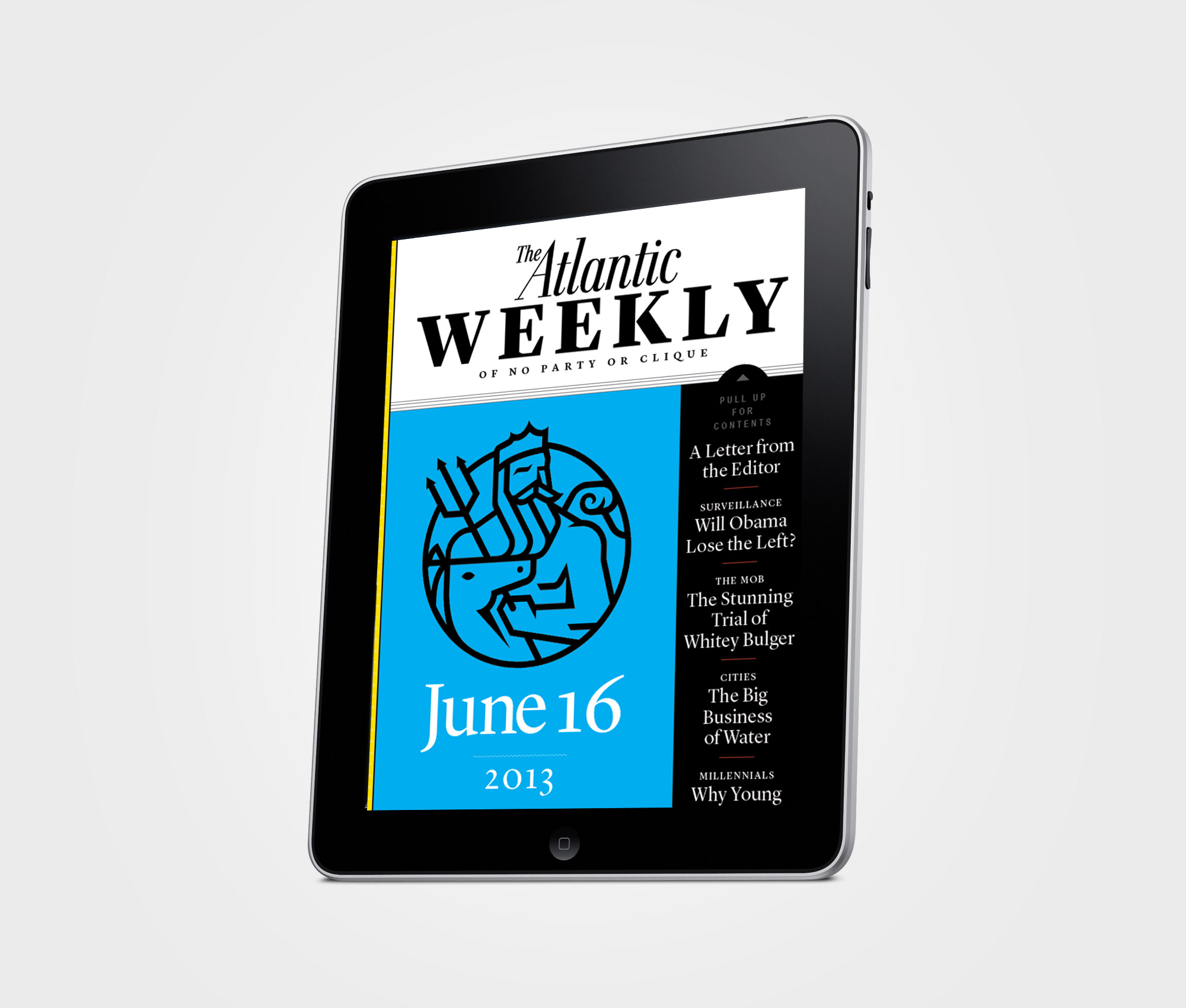
Below is the final version implemented in The Atlantic magazine and iPad edition.
