EOA Architects
SERVICES
Art Direction
Strategy
Brand Identity
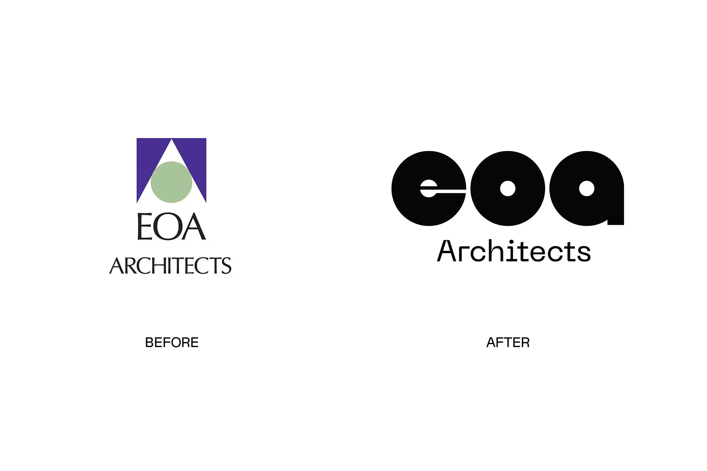
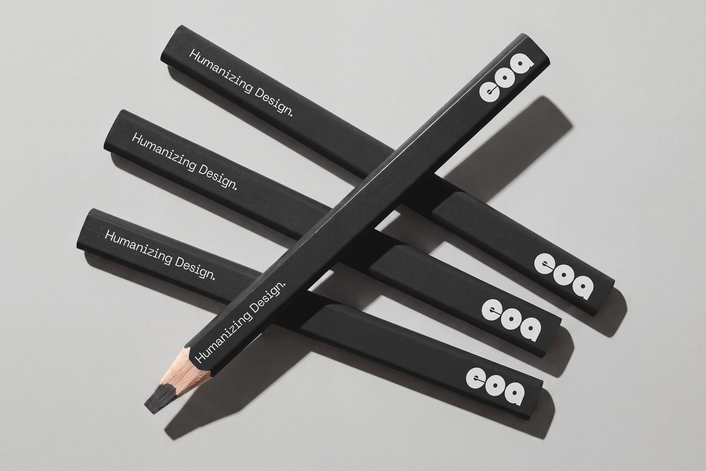
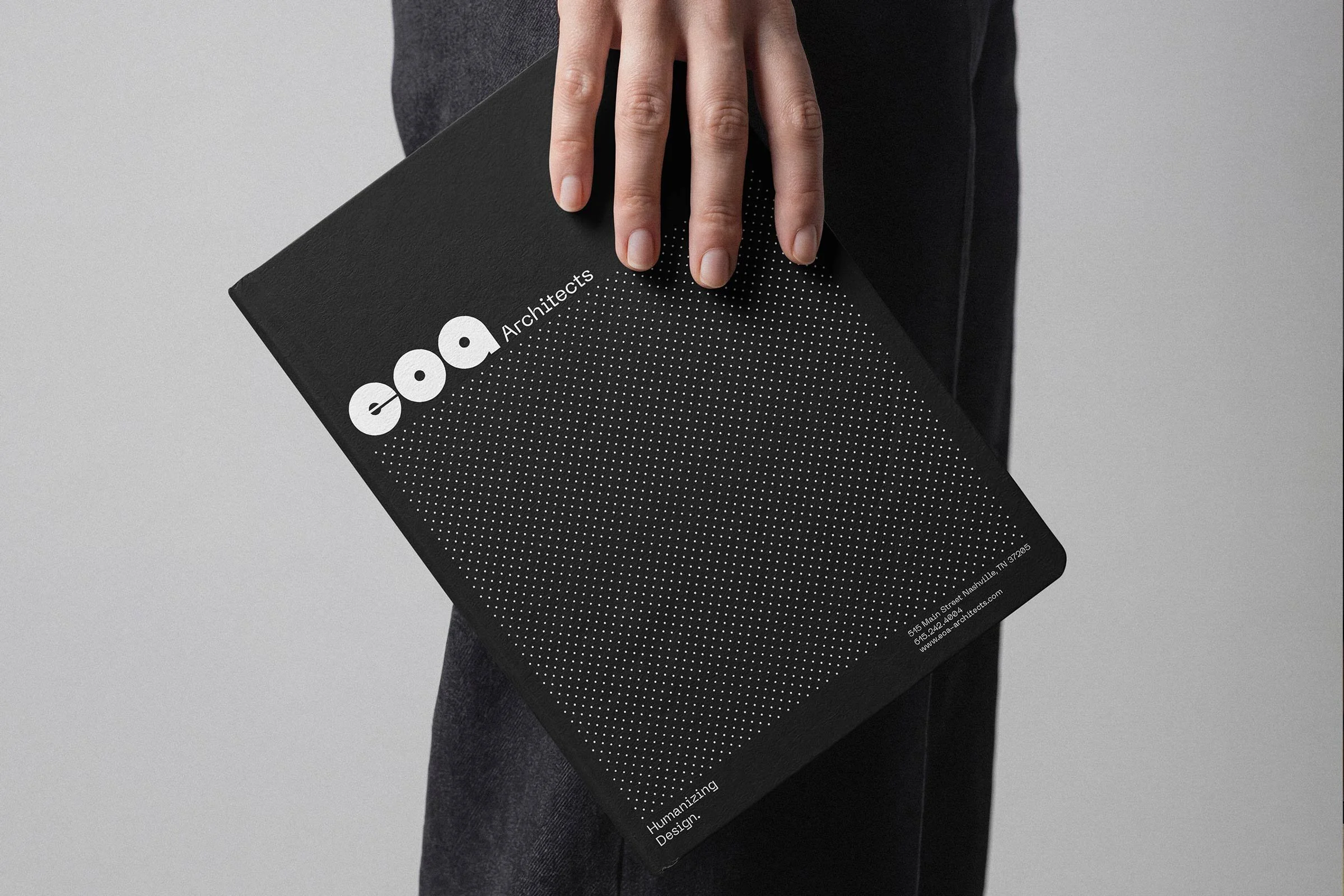
EOA Architects is an award-winning, female-ed architecture firm located in Nashville. They needed a refreshed identity to replace their dated, 1980s geometric brand. We retained the circle from the old logo. Since the lower case “eoa” is all based on circles, it made sense to lean into a circular motif.
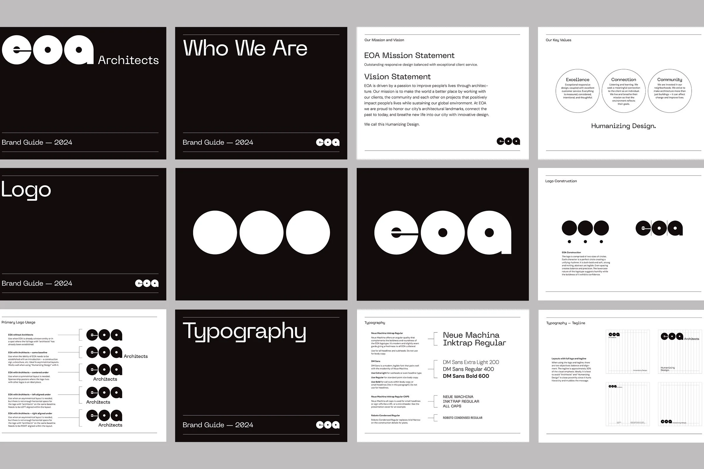
Additionally architecture logos aren’t often curved (lots focus on hard angles), so this felt like something slightly unexpected in the space. Plus, the firm is female-led and focuses on the holistic approach to architecture within the community. Again, the idea of a circle reinforced all of those core values. We still wanted to retain a rigidity that is inherent to the practice of architecture so we juxtaposed these curvilinear forms with a grid structure and minimal color.